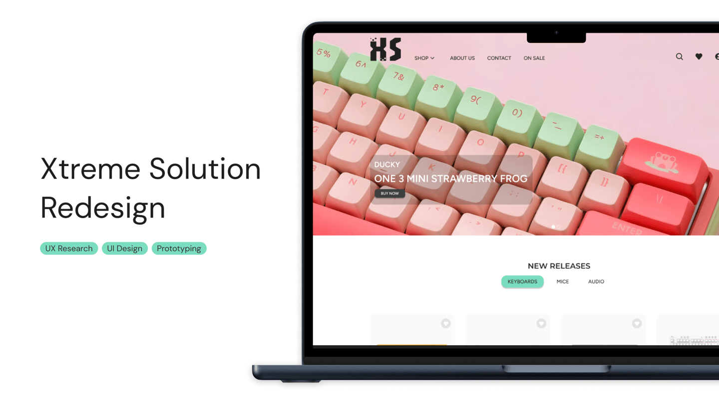
Established in 2011, Xtreme Solution set out with a vision to become the world's greatest gaming hub. From day one, their mission has been to bring the best and most ultimate gaming products to enthusiasts everywhere. Today, Xtreme Solution is a trusted name among gamers worldwide.
Xtreme Solution has a physical store located in Sim Lim Square that is commonly visited by gamers looking to upgrade their peripherals. However, not many know of its online store presence. The objective of this project is to freshen up the current website in order to bring in new customers and establish their online presence.
About.
Project Specifications.
Research.
Generally, people don’t usually visit gaming peripheral websites unless they are planning to purchase something for themselves. People generally do quite a lot of research externally on YouTube as well as forums to see what are popular trends and top reviewed products, and based on their findings, they’ll search up the items directly on websites.
Some others are open to browsing the website to see what is available, what’s new, what’s popular and what’s commonly purchased. Commonly used filters are price filters, brand, color, size of keyboard, wired/wireless and type of switches available.
The more experienced keyboard builders struggle with finding detailed information on websites, if what they’re purchasing comes with certain parts.
Struggles faced by less experienced peripheral purchasers are that they don’t find the information on the website relatable.
General struggle between these two groups is that they can’t figure out how the keyboards look like in a natural setting. And that website layouts can be messy and hard to filter through. Both groups want to know how the switches sound like, how it feels like. Both want to compare keyboards before purchase, but find it a hassle to go back and forth multiple tabs each time.
After a brief glance at the website, I identified a few issues at hand.
The website UI is outdated
Confusing and inconsistent information architecture
We are unable to make purchases directly on the website
A lack of a wow factor that can differentiate them apart from their competitors
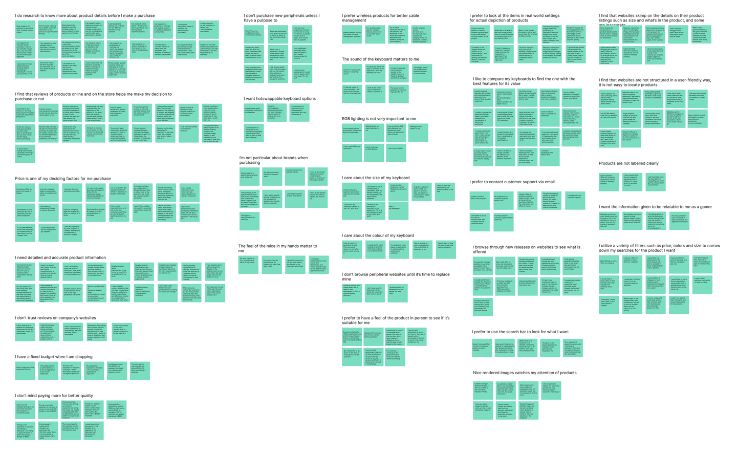

After speaking to many users, here's what we found.
Comparative Analysis.
Apple, Ikea
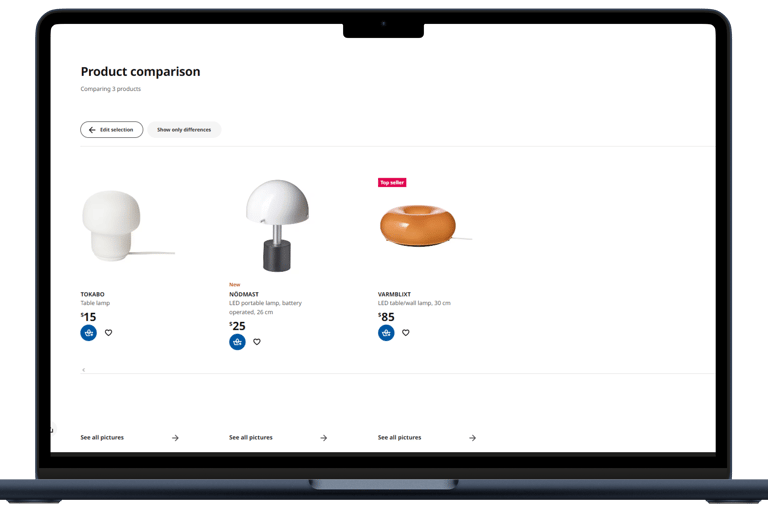
We found that both Apple and Ikea allow for users to compare their products with one another. Ikea has an extremely robust comparison function as users can compare as many products as they want to, compared to Logitech that allows for up to 5.
Ikea also has an extensive amount of filters available such as size, colour and price, whereas Apple offers no filter options.
Competitive Analysis.
Mash, Pantheon, Razer, ILUMKB, Logitech
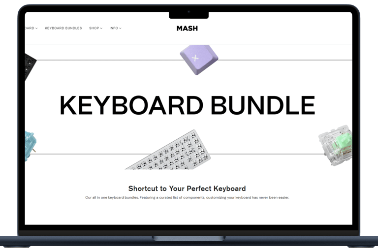
We found that out of these 5 websites, only Razer and Logitech offered the option to compare products with one another one.
All 5 of the competitors offer wide range of filter options available such as size of keyboard, colour, connectivity, switches and price.
In comparison to what Xtreme Solution has right now, the filter options are lackluster as we only have basic price filters at the moment. The website also lacks features such as the product comparisons.
User Personas.
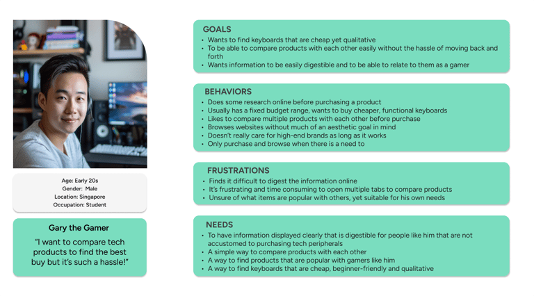
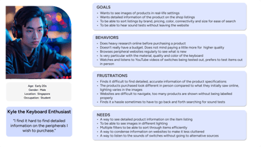
We identified 2 main user personas through our interview findings.
The first user persona, "Gary the Gamer" would resonate with gamers who are pretty new to purchase tech peripherals, or aren't as picky with their set-up. They don't mind going for something cheaper as long as it's functional.
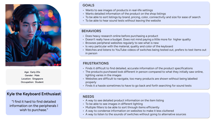
The second user persona identified is Kyle the Keyboard Enthusiast.
He would resonate more with those that have more experience with purchasing peripherals, and are very particular with their tech gear. These would encompass keyboard builders and mice collectors.
User Flows.
So... What's the solution to the problem at hand?
In order to boost the online presence of the website and to increase the number of page visits, I aim to address the concerns that users have by incorporating functions such as robust filters, sound tests, product comparisons and adding in accurate yet aesthetic images.
Asides from those, I endeavor to create functional product pages where users can make the purchase from the website directly instead of heading down to the physical store.
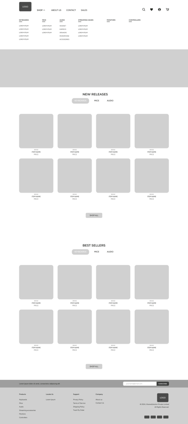
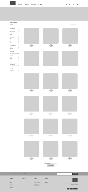
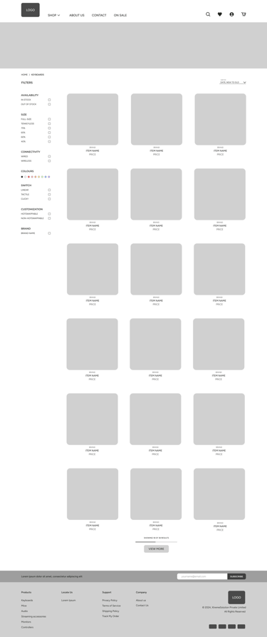
I aim to rework the information architecture of the website to make it easier to navigate by improving the categorization of sections.
Lastly, I aimed to add in a fun segment such as a quiz that could draw people to the website and that will be what sets it apart from others. Another unique feature would be a keyboard sound test.


13 participants, 21-35 years old.
Goal 01.
Establish online presence
Goal 02.
To allow users to make purchases online
Goal 03.
Increase traffic to website and active browsers


Duration: 4 weeks
Tools: Figma
The original look of the website.
So... What about the website?
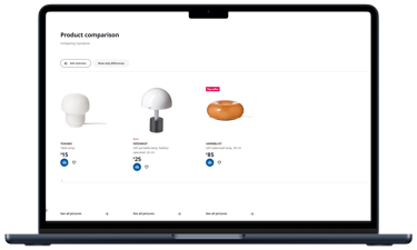
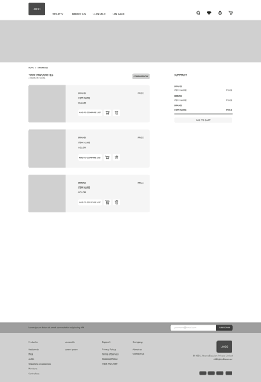
Gary needs a better way to compare products because he finds it a hassle to go back and forth on different websites for information.
HMW make comparing products less tedious?
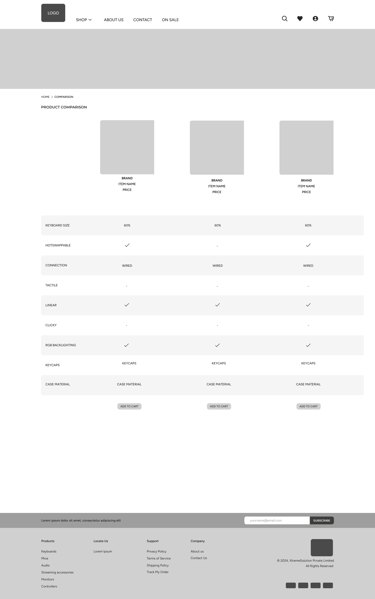
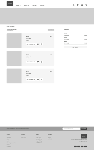
We create a page where we can shortlist 3 items from our favorites to compare side by side.
Problem
How Might We?
Solution

Problem
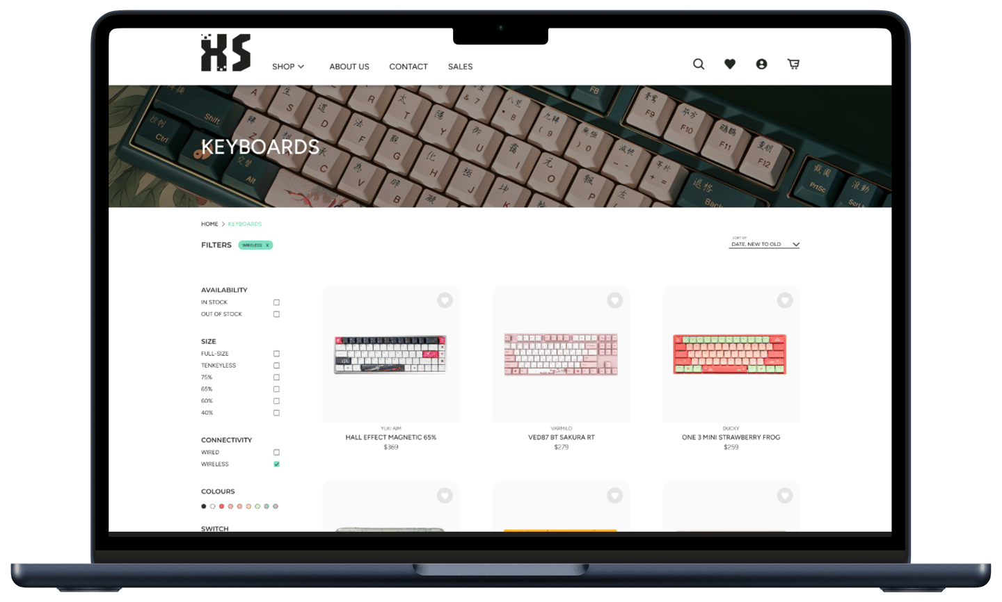
Kyle needs a better way to search for products that suits his personal preferences because he finds it a hassle to go back and forth on different websites for information
How Might We?
HMW make searching for the ideal keyboard a less complex experience?
Create multiple filters for sizes, colors, brand, connectivity for ease of search, with images and sounds for reference
Solution

Visual Identity.
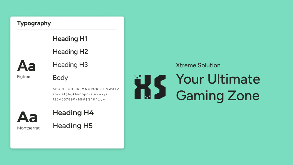
The original colour theme of the website was a vibrant neon green paired with white, which was harsh on the eyes. I chose a more muted teal colour to replace the neon green. A complementary pink was chosen as an accent colour. As a gaming peripheral website, I want to bring out the vibrant personalities of gamers by choosing brighter colours.
The logo is also reworked to create a more modern, tech feel.
Logo.


Information Architecture.


Wireframes.
Prototyping.




What keyboard are you quiz!
Usability Testing.
We recruited 5 participants for the Usability Test and assigned them 13 tasks to complete. The UT was conducted remotely over Zoom.
This testing included those who are experienced with peripheral purchases as well as those who do not do it often.
Participants successfully completed all of the tasks within the stipulated timeframe, achieving an average System Usability Scale (SUS) score of 85.5, indicating a high level of usability and user satisfaction.
Overall, users commented that they enjoyed the clean look of the website, however through our usability testing, we found out places with room for improvement. Participants were all ecstatic about the keyboard sound test and comparison options and thought that they were unique and helpful features.
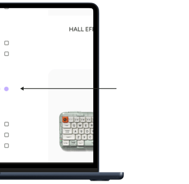
Finding #1.
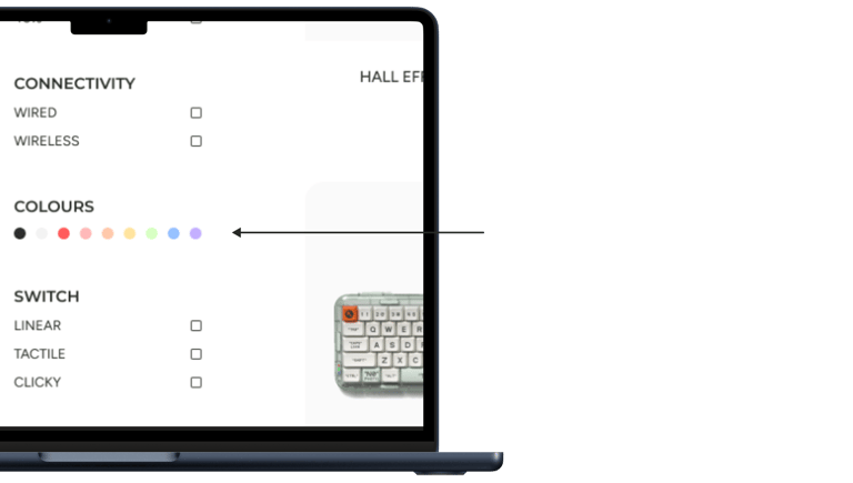
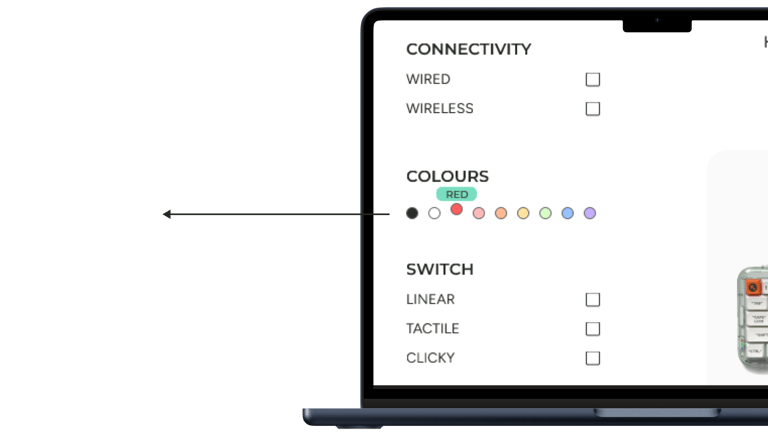
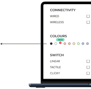
I had a user that was colourblind in this test. He wished that when the when the mouse hovers over the colour filter, a text would pop up to tell us what colour was selected as he is unable to tell what colours are available.
Conclusion.
The project was a fun passion project for me as an avid gamer myself! The overall website was successful as the final prototype was very well received by our UT participants.
I envisioned a website that was clean, modern and yet unique at the same time, which I believe I achieved through the inclusion of a "What keyboard are you" quiz as well as the keyboard sound test feature.
Future Plans.
Make a button that sticks onto the screen and allows us to scroll back up
More robust filter options such as RGB filter
Add more details into the comparison chart such as dimensions
More product images in real-world settings
Dark mode for the page
Slider bar for audio to increase volume and to pause/play at any time
Include more switch sounds for the different variants
A bar that shows the progress of the website - how much we have viewed so far
Proposed Solution.
When users hover over the colour, a pop up will let them know the name of the colour. Each colour also has a grey ring around it to make the lighter colours pop against the white background more.
Finding #2.
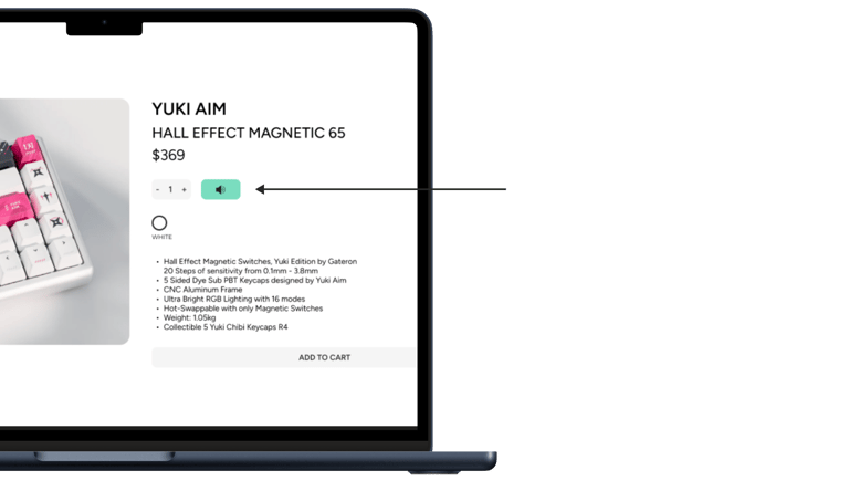
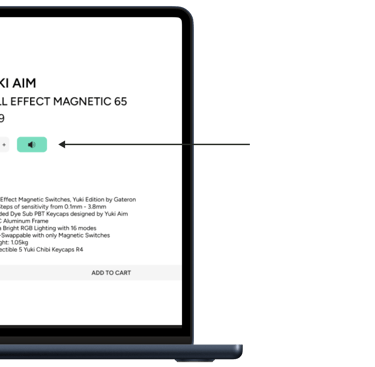
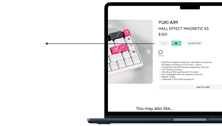
Users did not understand what the audio icon was, and initially thought that it was a text-to-speech option and some hesitated before tapping on the button.
Proposed Solution.
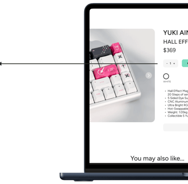
An icon named "Sound Test" is put right beside the audio icon to let users know the purpose of the button.
Finding #3.
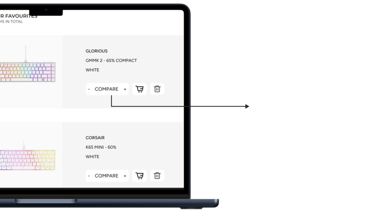
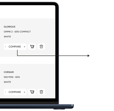
Multiple users were visibly confused by the + and - buttons on the compare button and they felt that it wasn't very intuitive. Some commented that the + and - signs were redundant.
Some users mentioned that there were no visual cues when the button was tapped and they didn't know if they were successful.
Proposed Solution.
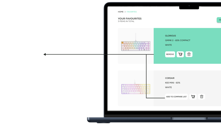
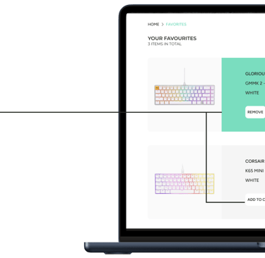
The + and - buttons are now removed to minimize confusion. Upon pressing the button, the card now turns teal as a visual indication that the item is selected. The button is also renamed to "Add To Compare List" for better understanding.
