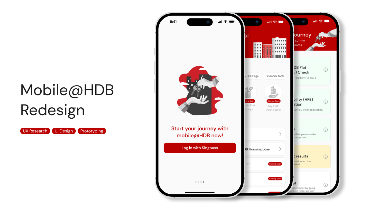
The objective of the Mobile@HDB app redesign is to enhance user experience by creating an intuitive, user-friendly, and efficient platform tailored to the evolving needs of our users.
The Mobile@HDB app was established to include a comprehensive range of online services and mobile applications that cater to various needs, from transactional services like application for flats and payment of loans to informational services providing details about housing policies and regulations.
About.
Team.
art&ale.
Claudia
Cheston
Angie
Hanis
Germaine
My role.
User Research
Prototyping
UI Design
Usability Testing
Project Specifications.
Duration: 5 weeks
Tools: Figma
Research.
Users say that the app is frustrating to use as it kept leading them back to the mobile browser. There is also too much information, making it difficult to navigate through and confuses them. Most of them use the application to find information while on the go, or to use the simple e-Services such as season parking renewal. First time homebuyers also wanted to see step-by-step guides or checklists for their HDB journey. Not everyone has heard or used the Mobile@HDB app, some of the insights were from their experience with the website, which still applies to our findings as the majority of the mobile app redirects users to the website.
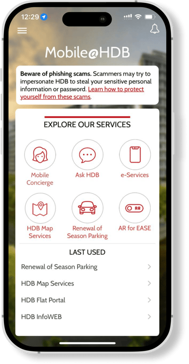
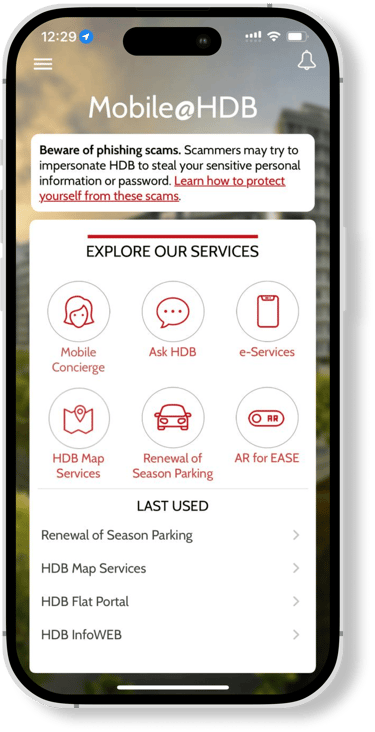
As soon as we were handed the project, our team looked through the Mobile@HDB app to get a deeper understanding into what we will be working on. There were a few glaring problems that we identified early.
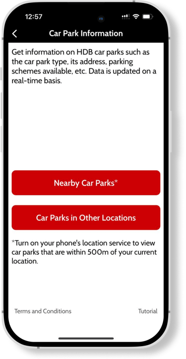
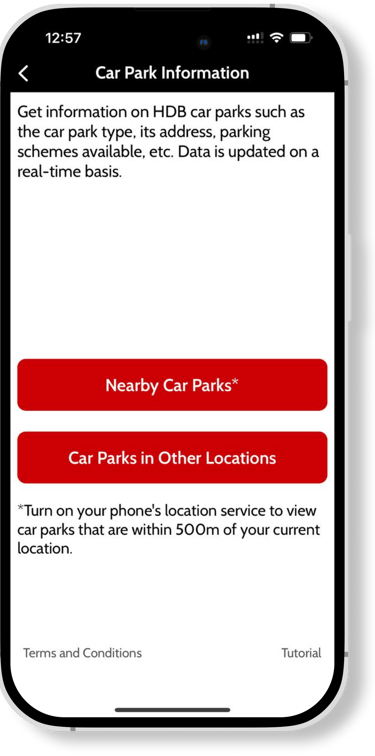
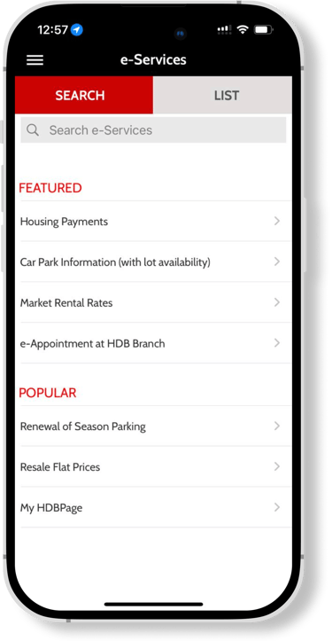
The app UI is outdated
Most of the buttons bring us back to the HDB website, in-app functionality is limited
Some buttons were not functional
Confusing to use as the function of certain buttons were not explained
We realized that this situation is unique, since the application mostly redirects us to the web browser. We knew that we wanted to improve the functionality of the app by reducing the number of times users are redirected to the in-app browser.

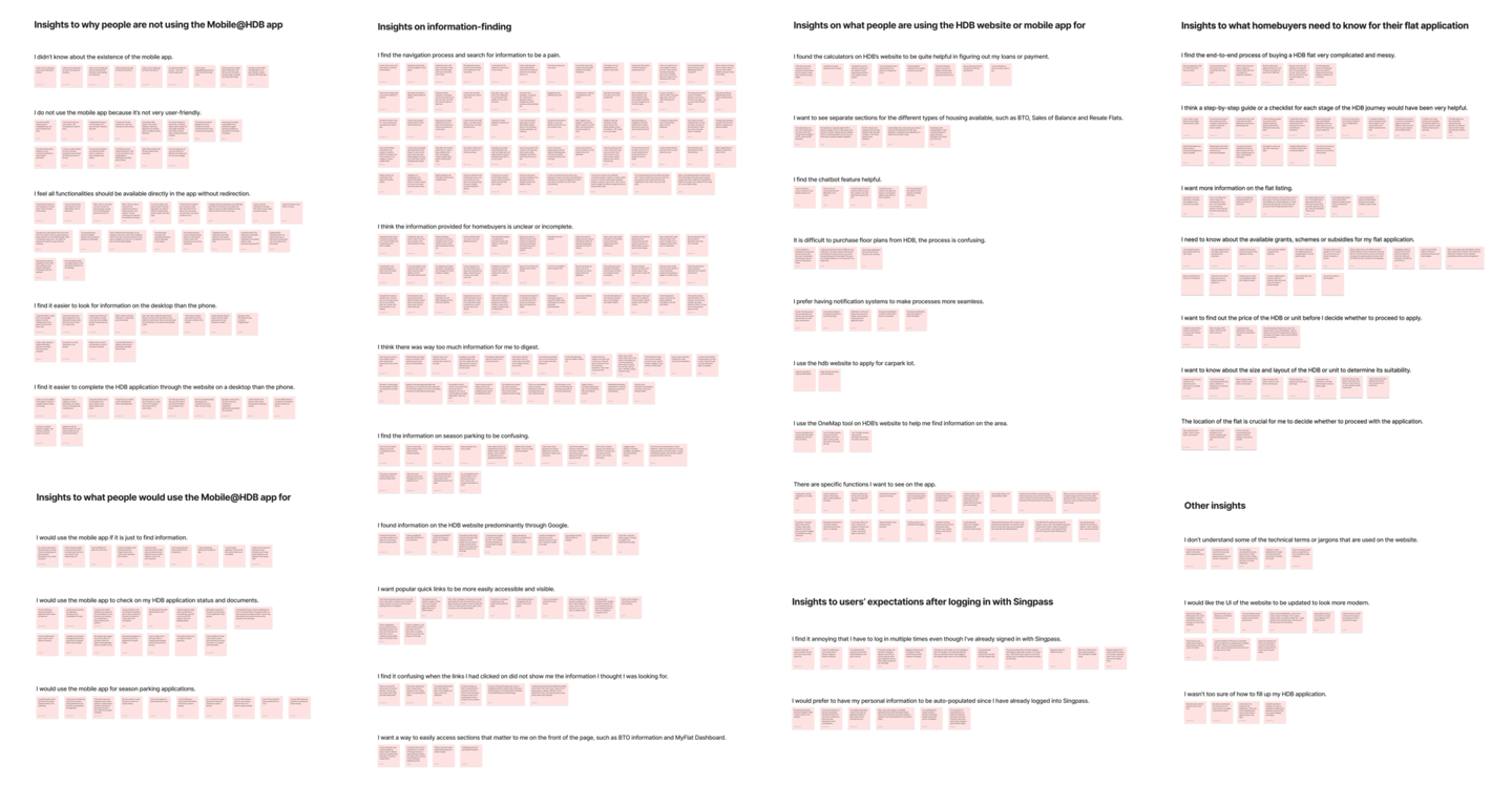
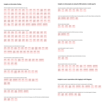
After speaking to many users, here's what we found.
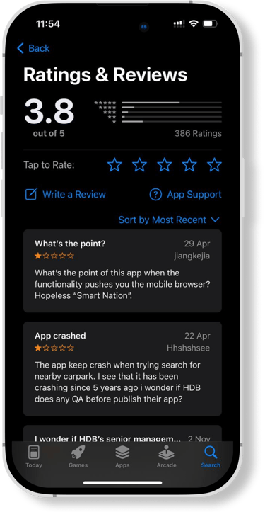
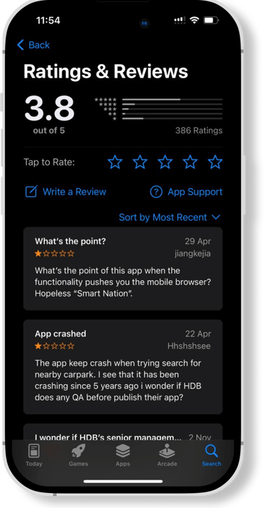
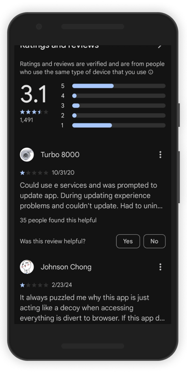
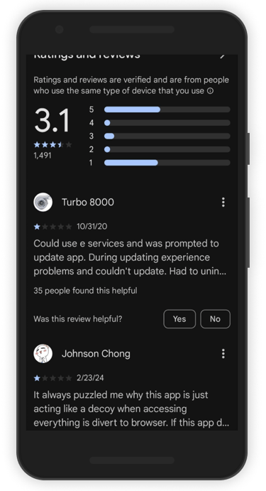
App Store Reviews.
The reviews on the app store tell us a lot about the user experience with the Mobile@HDB app. Here are some common complaints.
The app redirects them to the website
The app keeps crashing
They aren't able to use in-app functions such as making payments and the renewal of season parking
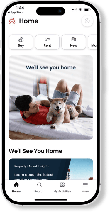
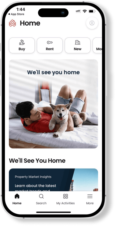
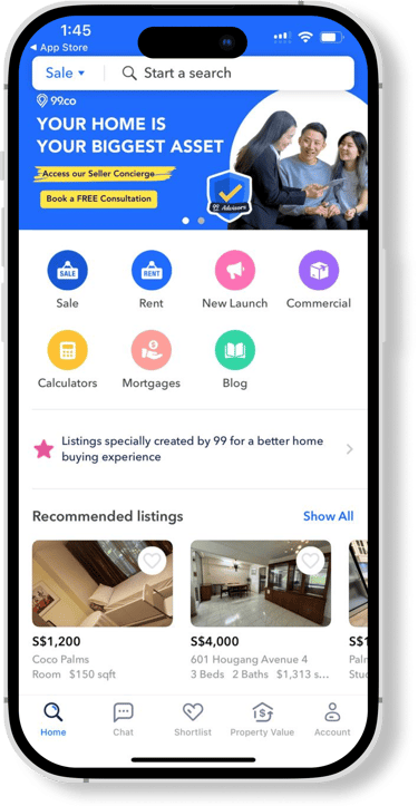
Competitive Analysis.
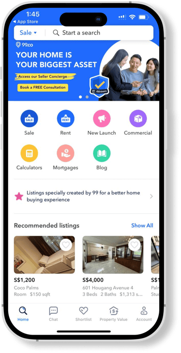
PropertyGuru, 99.co
We found that PropertyGuru and 99.co were intuitive, easy to navigate and information was easy to find. The key features are easily accessible from home screen. They are also trusted as a reliable resource for property buyers and sellers, with some complaints on false or duplicate listings by agents and technical issues
Comparative Analysis.
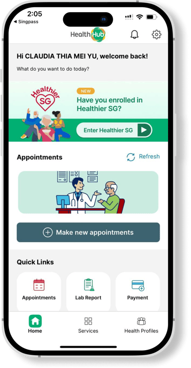
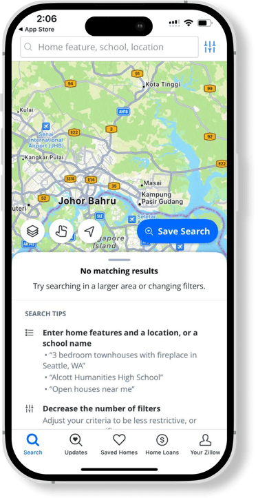
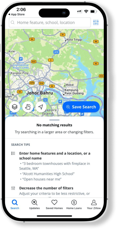
SingPass, HealthHub, DBS DigiBank, Zillow
We found that these applications had clear and well-organised categories. They are user-friendly and easy to navigate and there is easy access to “Favourites” or quick links. These apps are highly trusted due to government backing, enhanced security measures and/or data accuracy.
In conclusion, compared to Mobile@HDB, most pages redirects to an in-app browser, the app is difficult to navigate through and information is difficult to find. The key features are not accessible from the home screen. However, the app is highly trusted due to government backing.
User Personas.
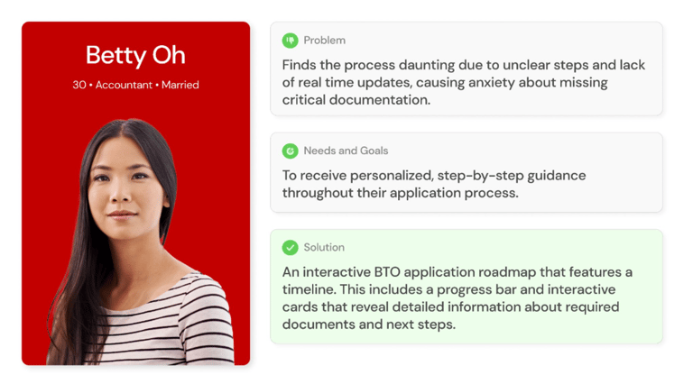

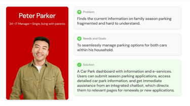

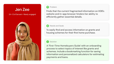
We identified 2 main user personas and created one universal persona through our interview findings.
Many of the users interviewed are first-time homebuyers who sought more clarity in the application process.
Asides from homebuyers, the second most common user group are those that utilizes the carpark services, such as season parking renewal. We find that this user group wants to get things done quickly, without having to scan through large chunks of information.
Lastly, our universal persona we identified would want to make use of the Mobile@HDB app to browse for more information in preparation for their future BTO. Although they're not immediately ready to buy yet, they find that having information prepared in advance would be helpful and would alleviate future stress.
User Flows.
So... What's the solution to the problem at hand?
We'd like to address the bulk of the frustration of users - the issue of the mobile app redirecting them to their in-app browser by building the features onto the app directly. In order to make it less overwhelming, we propose to include summarized information on the app. Users who want comprehensive information will be directed to the site if they wish to read more. Other e-Service functions will be made available on the app for quick access.
The information architecture of the current HDB website is overwhelming and would not translate well onto the mobile app. We will take a look at reorganizing the information architecture to ensure a smooth and less confusing user experience.
We wish to also introduce an interactive BTO application roadmap to solve the problem of users finding the application process unclear.
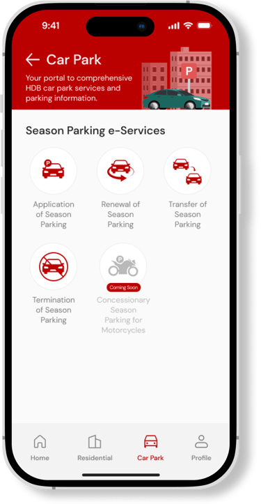
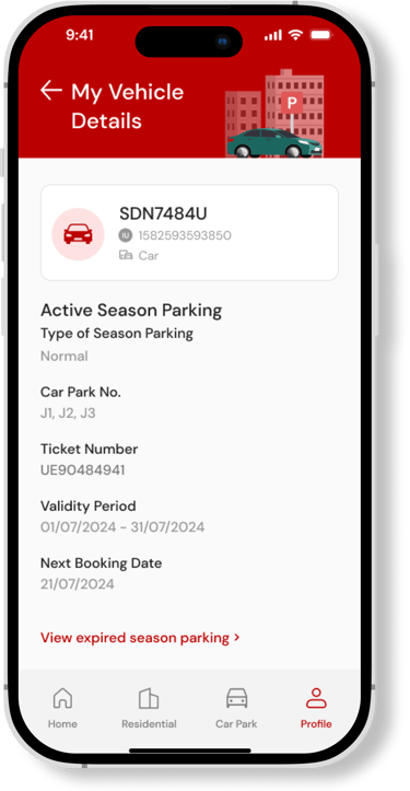
Lastly, we want to solve the problem of fragmented information on family season parking by providing an organized car park dashboard with detailed information and e-Services.

38 participants, 18-44 years old.
Visual Identity.
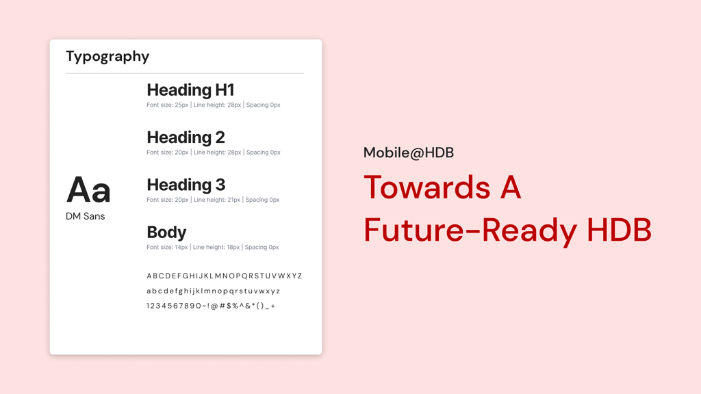
We kept the trademark, vibrant HDB red in the design as we wished to preserve the Singaporean brand identity. A sleek, easy to read sans-serif font was chosen to highlight the modern feel of the app, which is in line with the slogan, "Towards a Future-Ready HDB"
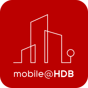
We designed a new, modern logo to reflect the feel of the newly redesigned app as the current app does not have a unique logo. This will further strengthen the Mobile@HDB brand.


Logo.


Prototyping.


Usability Testing.
We recruited 12 participants for the Usability Test and assigned them 17 tasks to complete. The UT was conducted remotely over Zoom.
This testing involved a diverse group of participants representative of the app's user base, including BTO applicants, season parking users, and prospective homebuyers.
Participants successfully completed the majority of tasks, achieving an average System Usability Scale (SUS) score of 82.7, indicating a high level of usability and user satisfaction.
However, there were 3 instances where users did not complete the tasks given:
One user kept tapping on the onboarding screens instead of swiping.
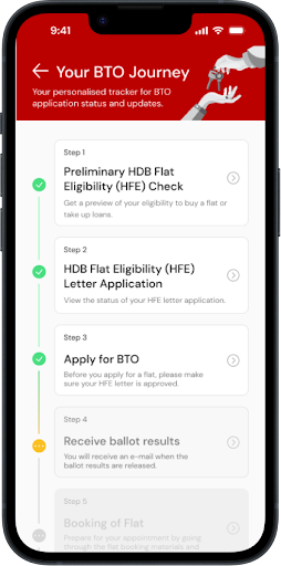
A user missed seeing the balloting status card on the BTO journey.
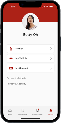
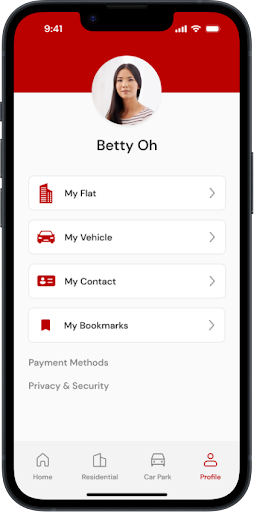
Another user missed seeing the bookmark icon in the bottom navbar.


Before
After
Finding #1.
Users found that the bookmark and notification icon on the navigation bar was not as important to them, and would prefer to have icons that they would use more often.
Proposed Solution.
Bookmarks page will be placed in the user profile, and the notifications will be on the main dashboard. The icons in the bottom navigation bar will be replaced with the “Residential” and “Car Park” icons.
Finding #2.
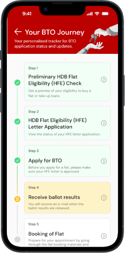
Users were not aware that the greyed out cards in the BTO Journey were clickable, and thought that they were disabled due to the colour.
Proposed Solution.
Previously greyed-out cards have been replaced with white ones, to signal to users that they are able to click on the upcoming steps to view more details. Additionally, the card colours have been updated to improve user visualisation of their progress through the steps.


Before
After


Finding #3.
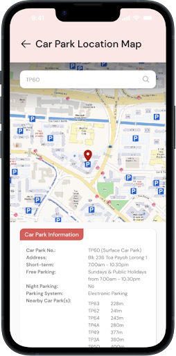
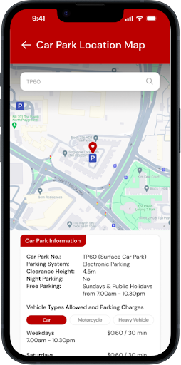
Users found the original car park location map to be overwhelming and were confused as they couldn’t easily tell where the other car parks in the vicinity are. They also wanted to be able to click on the car park icons directly to view relevant information, including short-term parking charges.
Proposed Solution.
The car park location map was updated to allow individual car park icons to be tapped on for more information. Parking charges were also included into the car park information section. Additionally, we changed the UI to match the look of Google Maps as people are more familiar with it.
Conclusion.
The project overall was a fun challenge and the final prototype was very well received by our UT participants. We had a vision to transform the Mobile@HDB application to one that is clean, modern and highly functional and we are happy to hear the positive feedback from our participants. With that, we also discovered areas where there are room for improvement.
Future Plans.
In the short term, we plan to enhance user satisfaction and engagement by optimising current functionalities through incremental innovations, such as refining user interface elements based on predefined standards (e.g. Singapore Government Design System guidelines) and bolstering app stability.
For the mid-term, we aim to expand the app’s capabilities by introducing adjacent innovations such as additional financial tools and the Resale Flat Listing (RFL) service, while also planning to extend the application to other devices, such as tablets, to increase accessibility.
Over the long term, we envision transformational innovations that incorporate advanced technologies such as AI for personalised housing advice and AR for virtual property tours. By adhering to the Innovation Continuum Framework, we are positioning the Mobile@HDB app to continuously adapt and respond to immediate user needs while also proactively anticipating and shaping future demands, ensuring its sustained relevance and utility in a dynamic digital environment.


Before
After


